Paper of the Year 2022
The Paper of the Year exercise is part of tradition in the Jacobsen Group at Harvard Chemistry and Chemical Biology. It is the group's celebration of advances made in the past year in organic chemistry.
We undertake a selectiion process that results in ~1500 papers in a primary list. This represents a human-curated body of literature that is germane to our group's research (and likely that of other groups that also focus on the development of organic catalytic methodology).
The motivating question is:
What insights can we gain from treating this list of documents as a corpus and applying statistical and semantic analysis to it?
The basics
We selected 1379 papers this year. The breakdown by journals is:
| journal | count |
|---|---|
| Science | 33 |
| Nature | 29 |
| J. Am. Chem. Soc. | 491 |
| Angew. Chem. Int. Ed. | 344 |
| Chem. Sci. | 85 |
| Nat. Commun. | 74 |
| Org. Lett. | 72 |
| ACS. Catal. | 61 |
| Adv. Synth. Catal. | 60 |
| Nat. Chem. | 53 |
| Chem. Comm. | 43 |
| Nat. Catal. | 17 |
| Proc. Natl. Acad. Sci. USA | 10 |
| ACS Cent. Sci. | 7 |
For some analyses, we'll adopt the following division of these journals into three Groups:
- Science, Nature
- J. Am. Chem. Soc., Nat. Chem.
- everything else
Altogether, these papers constitute a corpus of around 3.8 million words, after removing stopwords ('a,' 'the,' 'only,' 'then,' 'which,' etc).
Word distributions
Are there words or phrases that occur with different frequencies between journal groups?
For this analysis we'll group the journals into Tiers 1 (Science, Nature, J. Am. Chem. Soc., Nat. Chem.) and 2 (the rest). We can plot words based on their relative frequencies in Tier 1 and Tier 2 journals on two axes. The following plot was generated on single word frequencies from the abstracts. Click on the following plots to load the interactive versions (takes about a minute).
Each point on the plot is a word. Its position is determined by its frequency in Tier 2 journals (x axis) and Tier 1 journals (y axis). For example, "CH" in the top middle region of the plot, presumably related to CH functionalization, occurs more frequently in Tier 1 journals and Tier 2 journals. Not every word in the plot is labeled; if you want to look for a particular phrase (e.g. asymmetric), type it in "Search the chart". If you click on a word, you can see all the contexts in which the word occurred.
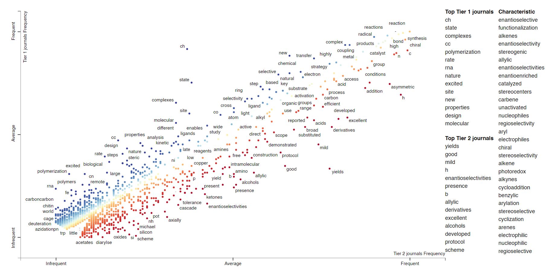
Clearly this is also a way to learn about whether particular words or topics occur more often in higher- vs lower-impact journals. We're not restricted to individual words; we can also do this with phrases of an arbitrary length ("noncovalent interactions," "asymmetric catalysis"). Here's the plot; there are some obvious artifacts like "Nature Chemistry" that should be ignored.
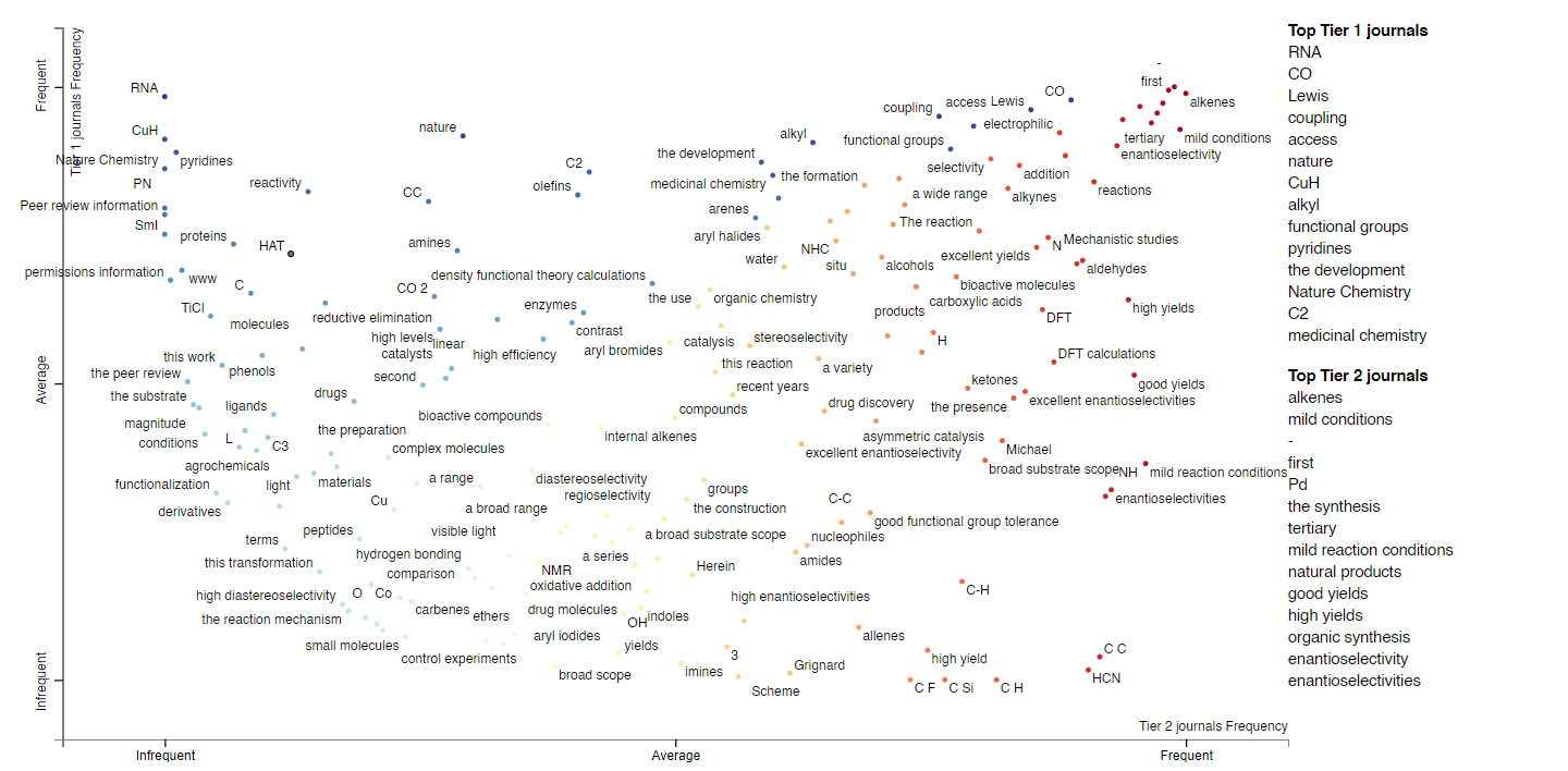
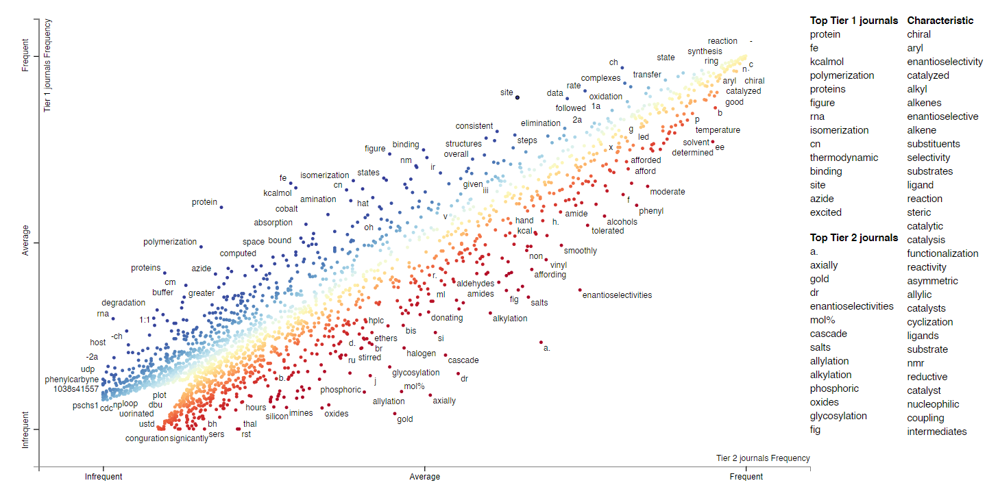
We can extend this analysis to the full texts; here's the plot/link for single word frequencies for full texts. Now we have a larger body of words, so we can ask questions like, "are KIE studies more prevalent in Tier 1 or Tier 2 journals?", "are Hammett or RPKA analyses more prevalent?", "is B3LYP or M062X a more popular functional?" One way to do this is to look for words like "KIE," "Hammett," or "DFT" in the following plot. (Since so many words are shown on the plot, it's probably easiest to just use the search bar.)
Topic modeling
Are there particular reoccurring groups of words across documents that correspond to conceptual topics?
From this collection of abstracts and body texts, we can apply topic modeling to discover "latent" topics that appear across documents. In our case, for instance, we might expect the topic model to discover topics (represented by groups of words) that correspond to conceptual themes like asymmetric synthesis, photoredox, electrochemistry, etc.
We apply Latent Dirichlet allocation, one of the most commonly used topic modeling approaches, to the total group of abstracts and full texts, then to individual journal groups.
Here are the topics modeled for all the abstracts. On the left in the following visualization, the topics (30 in this case) are plotted on a two-dimensional reduction of the feature space (basically Principal Component Analysis). The closer they are, the more "similar" they are in topic space. Click or hover on a particular topic to see the keywords that are associated with the topic, and their prevalence in the corpus (i.e. the body of text). The larger the circle, the more important/prevalent a particular topic is, i.e. topic 18 is most "important," and that makes sense since it's a topic about synthetic chemistry (and therefore applies to most papers). Not only can we learn about topics that are important, we could perhaps also learn about vocabulary that was "trendy" this past year.
Here's the topic model for the abstracts in Group 1 journals (Science and Nature). Because there are much fewer papers in this group, the prevalences of topics are smaller. Though we could potentially learn something from the difference in topic importances.
The topic model for all the texts:
The topic model for texts in Group 1:
If you're interested, here are the topic models for:
Citations
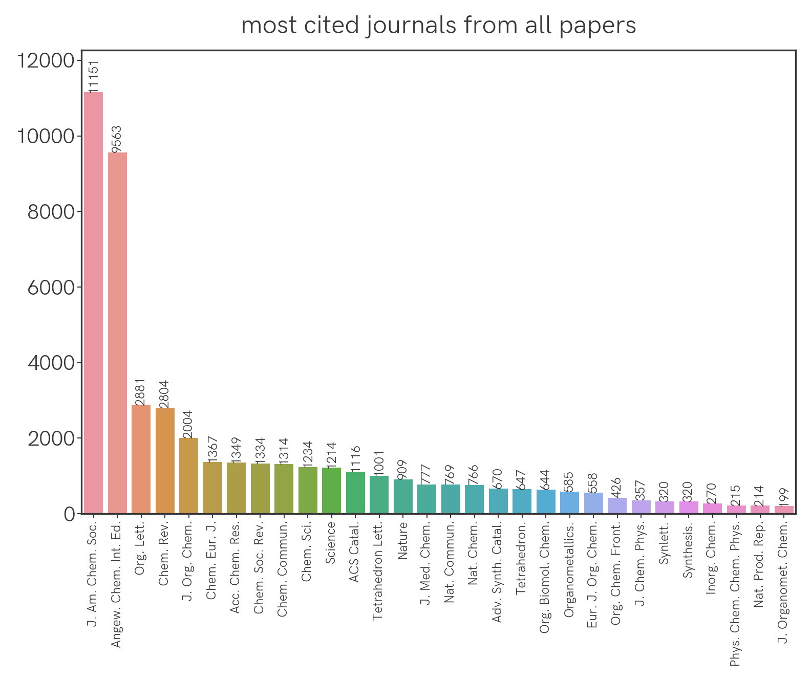
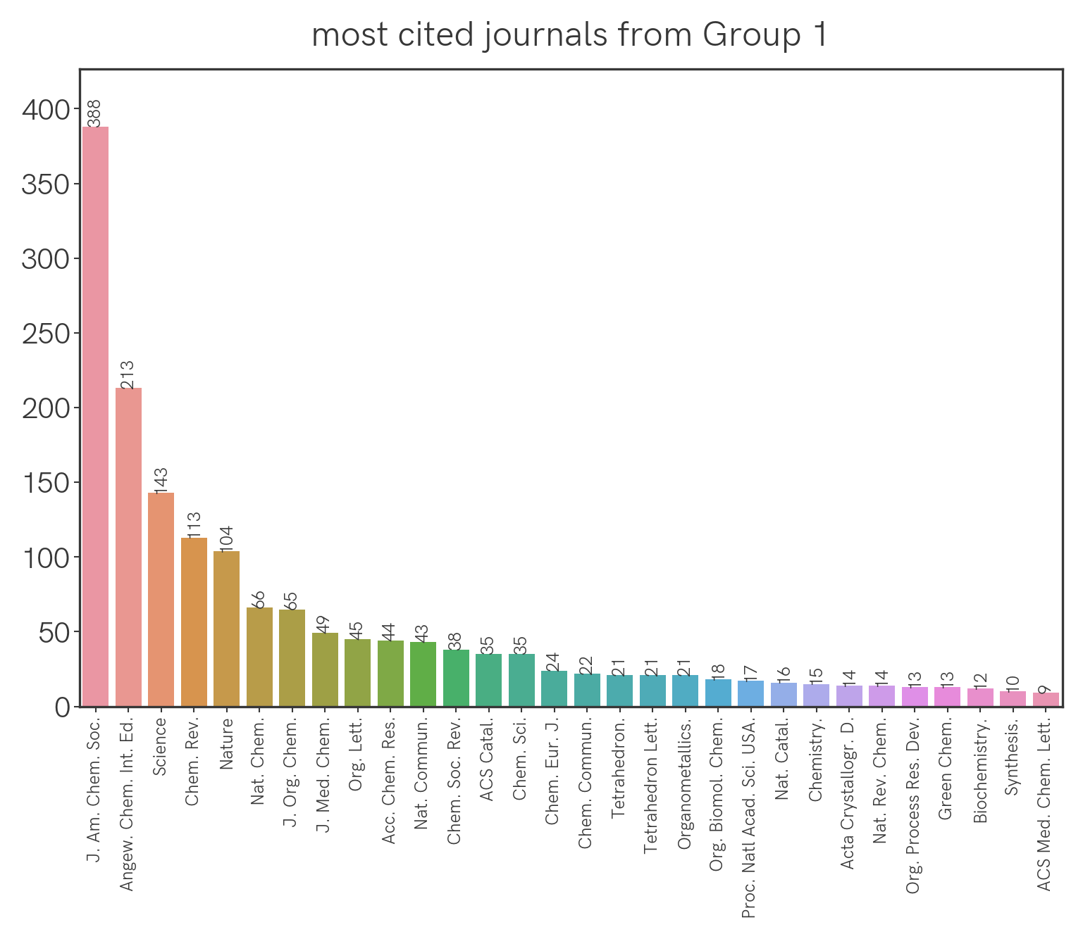
Which are the most cited journals overall, and by journal group?
We can extract all the citations from the papers this year and group them by journal. This is what we get for all the journals:
For Group 1 journals:
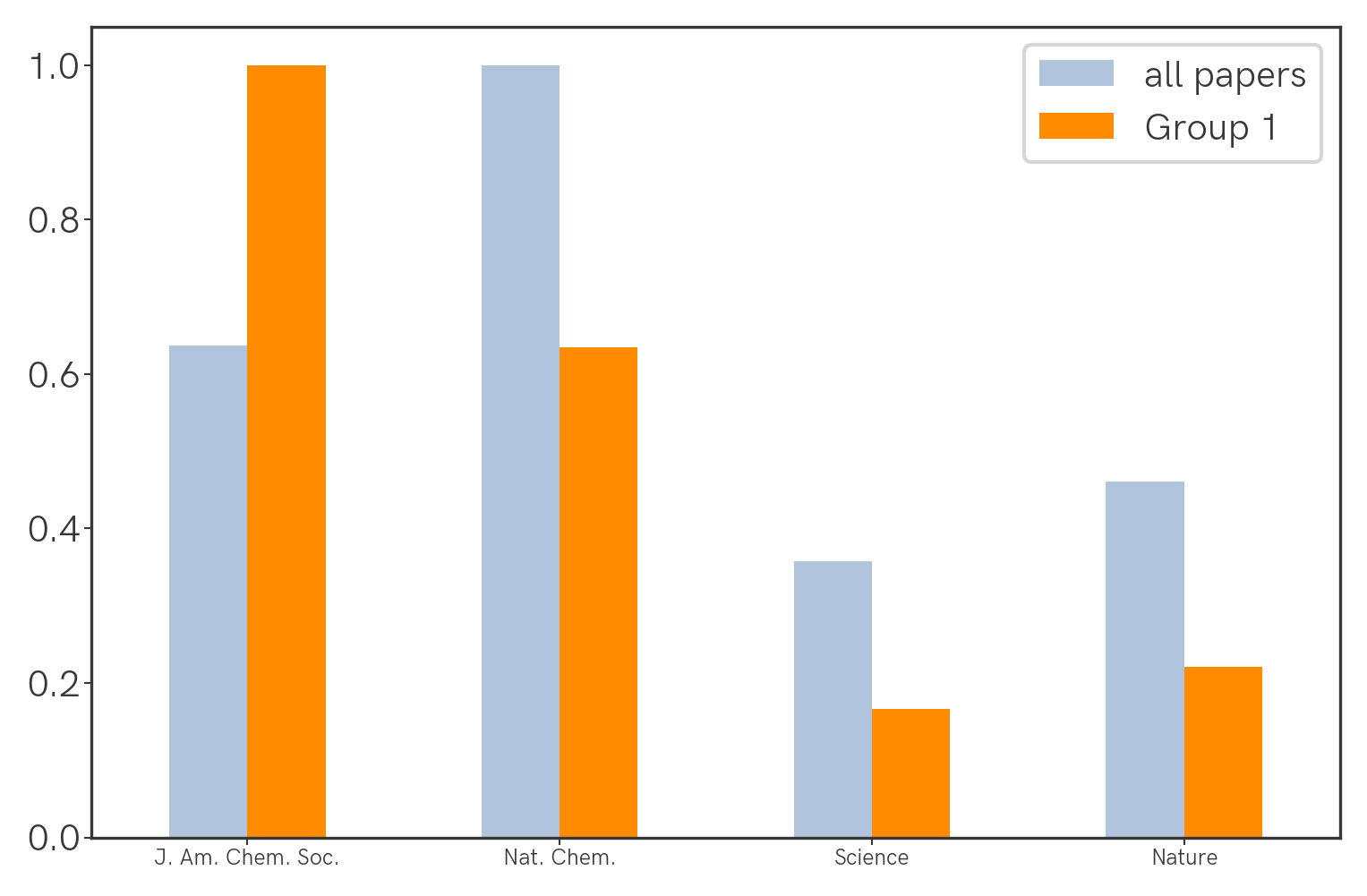
Seemingly the highest-impact journals (Science, Nature) aren't being cited the most, but this could be confounded by the fact that they simply publish fewer papers that are specific to our field. We can correct for this by normalizing the citation count with the number of relevant papers that were published (this year, as an arbitrary benchmark) in a particular journal. With that we get the following:
Temporal distribution
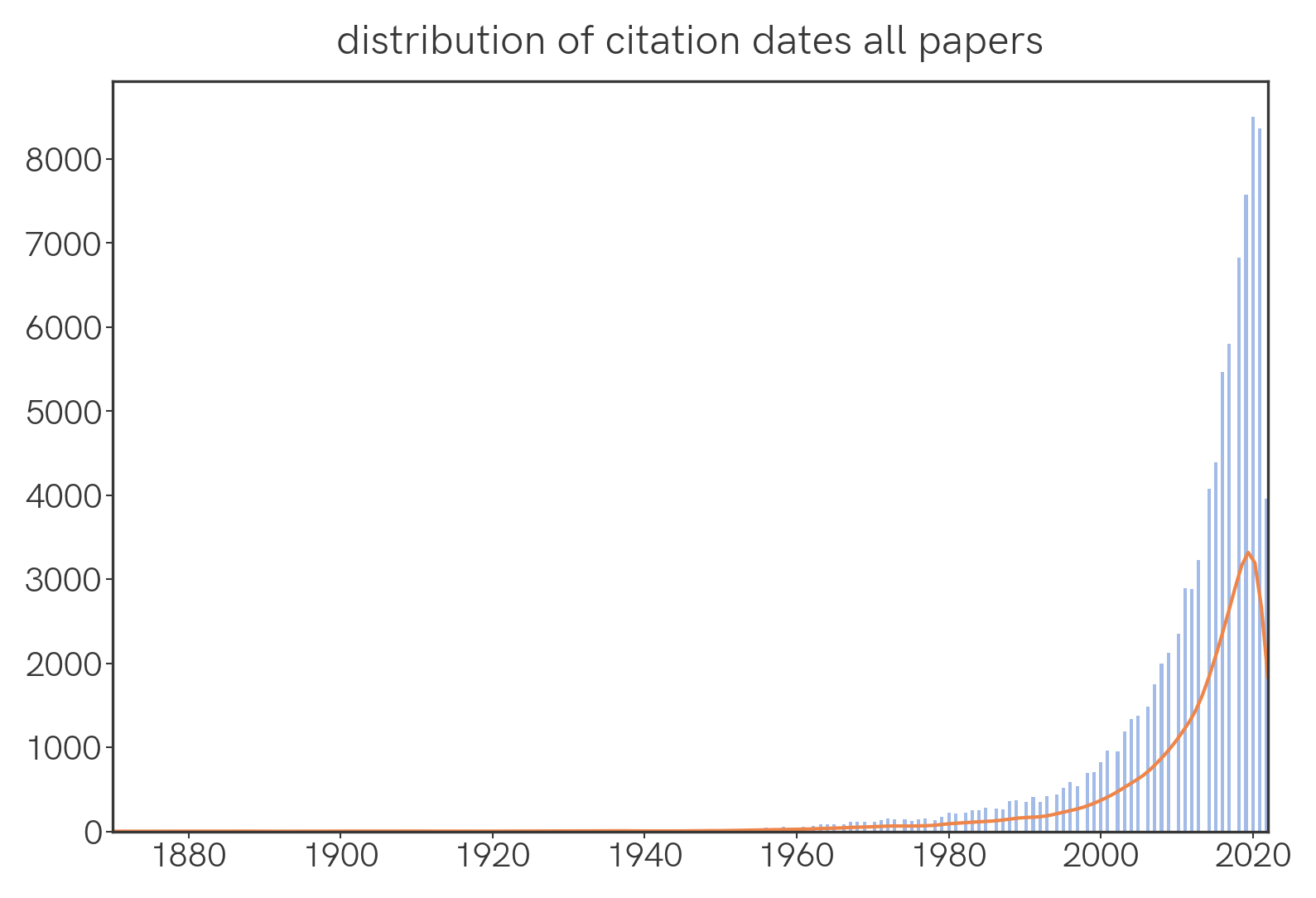
What is the temporal distribution of papers that were cited this year?
We find that the number of cited papers sharply decreases as we go back in time.
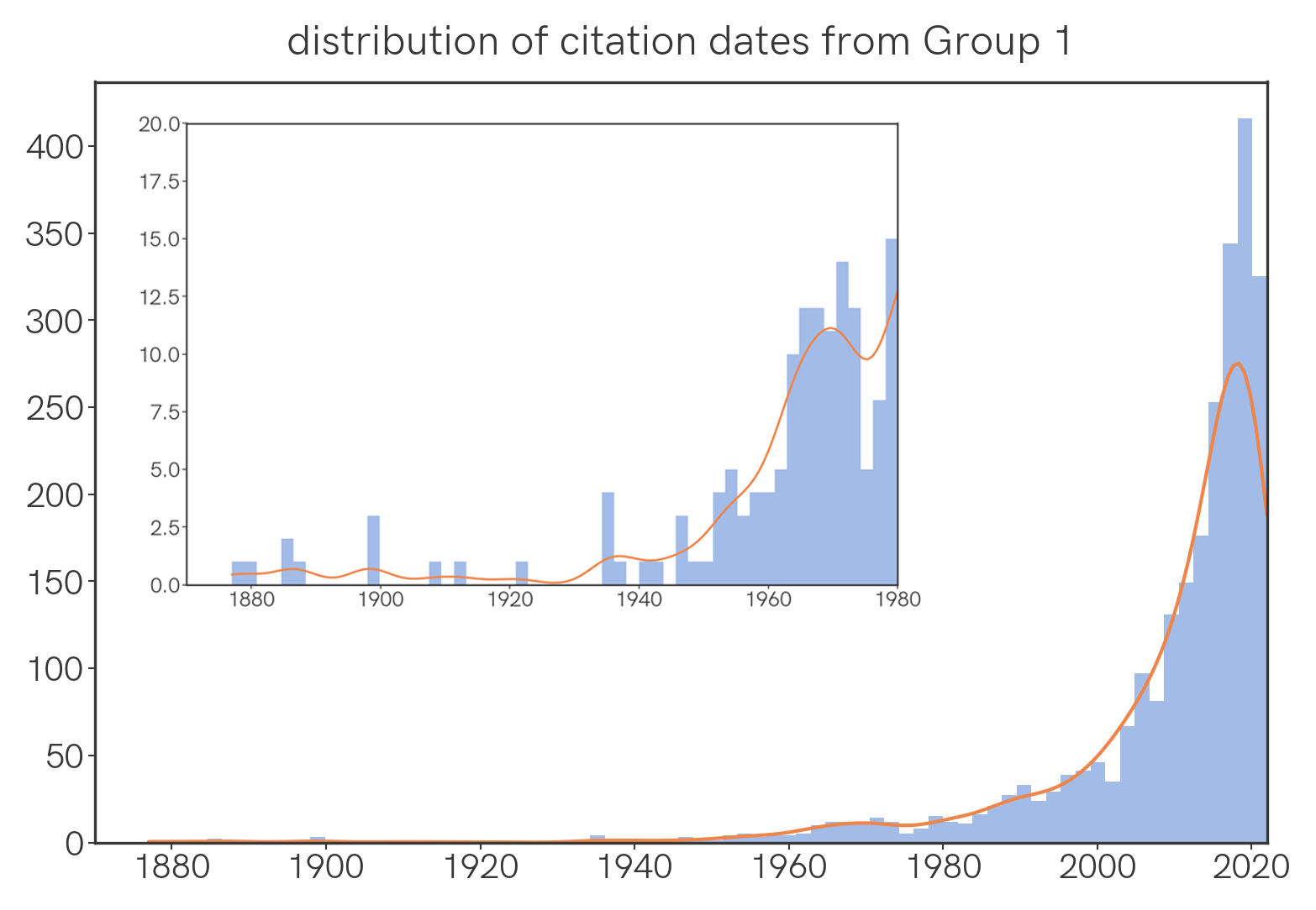
Among Group 1 papers, the same is generally true, though there is a comparatively large number of old papers cited, with a noticeable hump around 1970 🤔.
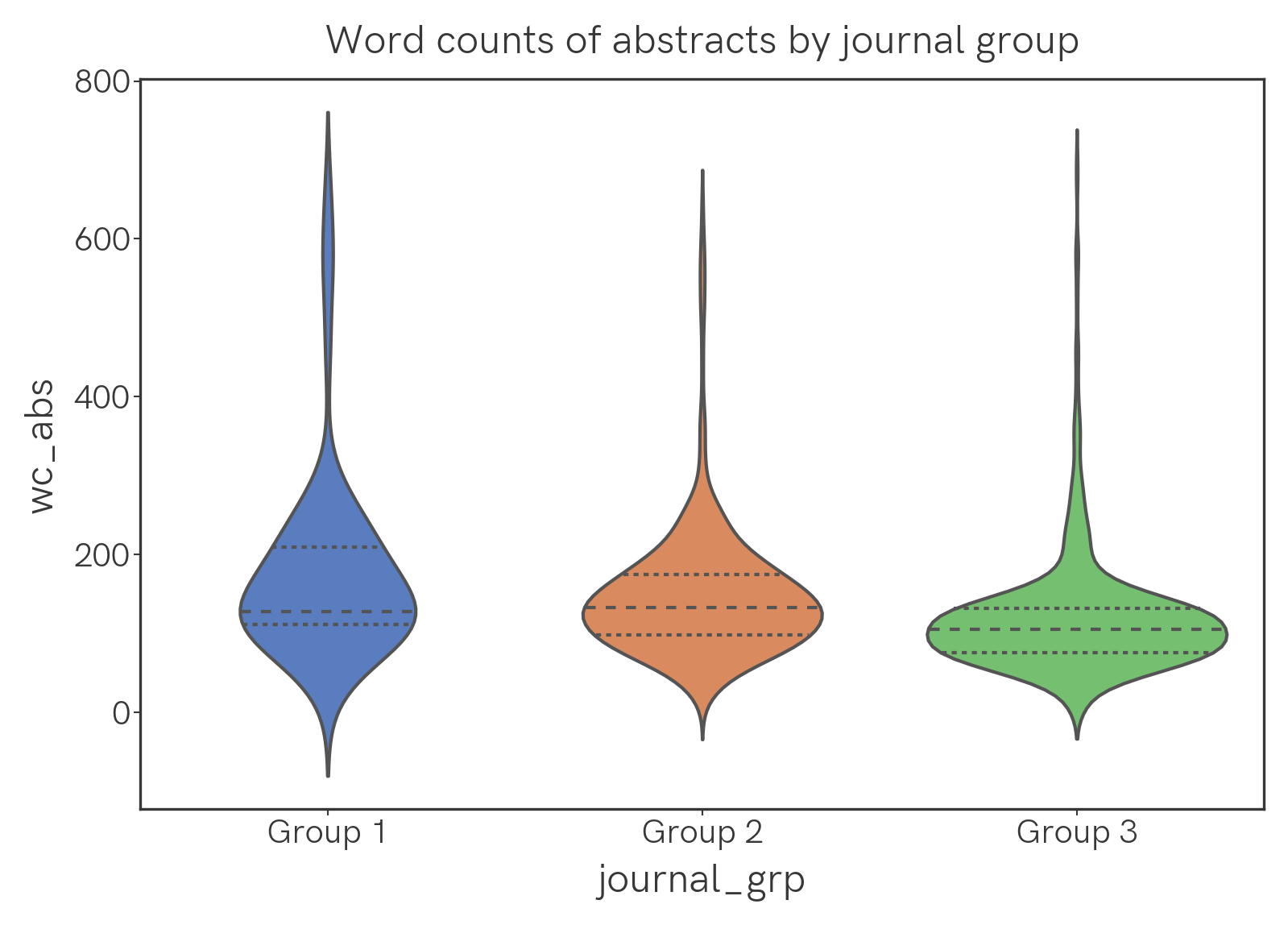
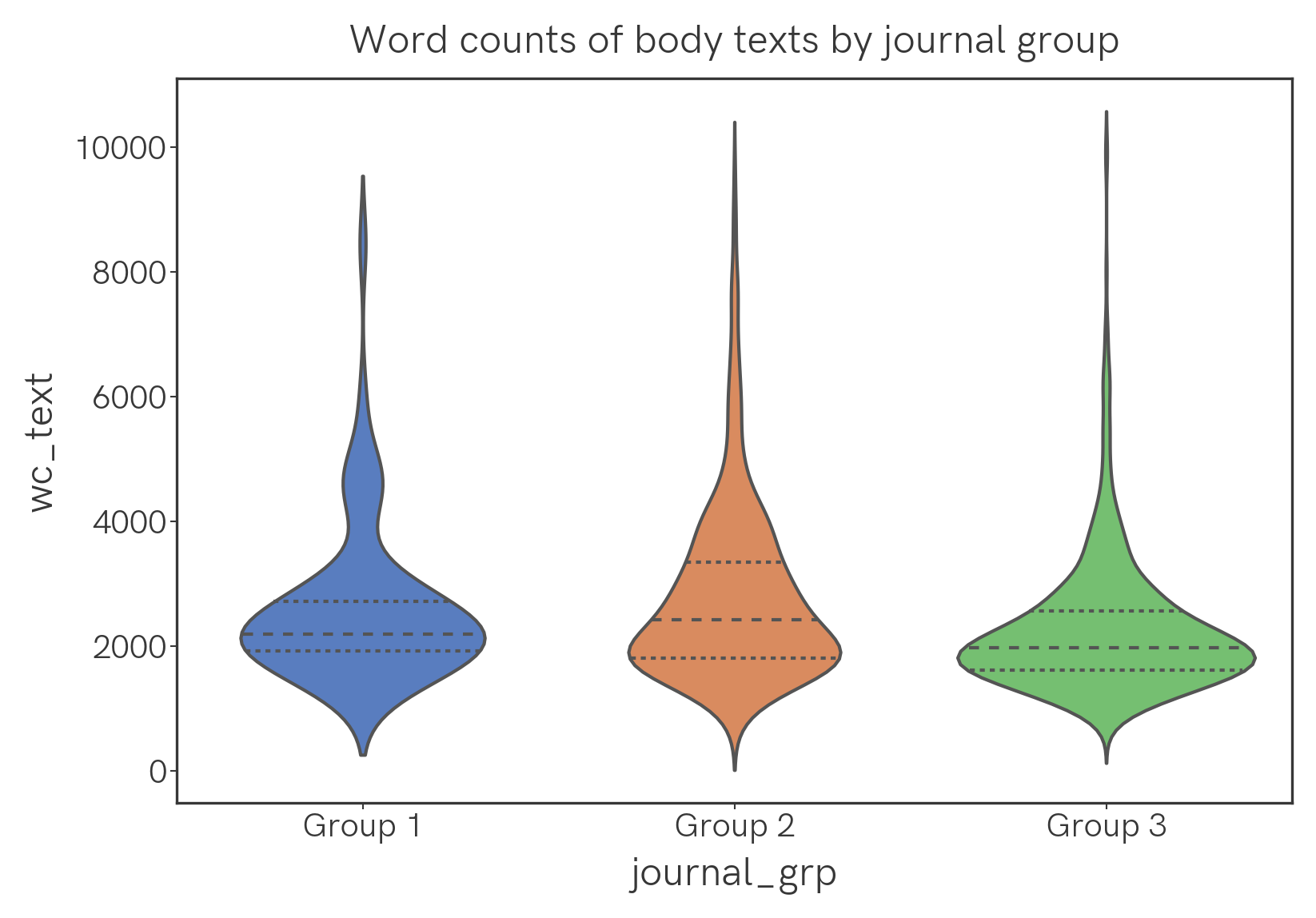
Word count
What's the distribution of word count in abstracts and full texts?
Here are violin plots and text-wc-violin.png of the word counts of abstracts and main texts, analyzed by group. The width of the plot corresponds to frequency; the dotted lines in the plots are the quartiles.
Geographies
What's the geographic distribution of papers we picked this year?
For S&Gs we can plot the affiliations of all the authors on a map, as follows. Red markers correspond to Group 1 and Group 2 journals, blue markers to Group 3. When a location has multiple papers affiliated with it, all their markers overlap and therefore only one (randomly selected) paper marker is shown. Quite a few errors exist, but the overall clustering pattern is probably accurate.
Methodology
Papers were downloaded as PDFs from the publisher's sites. The PDFs were processed with GROBID, a machine learning library that parses PDF documents into structured XML documents. It's a really powerful and surprisingly accurate parser for scientific documents, including functionality to recognize, parse, and Crossref-verify references. The abstracts and body texts were extracted after removing references to citations and figures. For journals without abstracts, the first paragraph was taken to be the abstract.
The two-axis text plot was created with scattertext, a truly awesome and rich package with support for a large variety of analyses, most of which I have not used for the PoTY project. Visualization of associations for phrases was done with pytextrank as part of a spaCy pipeline.
For topic models, the text was tokenized and stemmed using a Snowball stemmer and stopwords included with the NLTK package. We use the LDA model from tomotopy. Visualization of the topic models were achieved with pyLDAvis, which is the Python implementation of the R-based LDAvis.
Geographies were processed with the ArcGIS provider in Geocoder; maps generated with Folium.
Acknowledgements
I am indebted to all Jacobsen Group members, present and past, for making the PoTY exercise possible. Particular thanks to Prof. Eric Jacobsen for heading this exercise and Martin Reiterer for organizing the paper list. I gratefully acknowledge suggestions and thoughts from Diego Diaz, Prof. Richard Liu, Gabriel Lovinger, Petra Vojackova, Corin Wagen, and Michi Yasunaga.
Primary content for this analysis is copyrighted by ACS Publications, Wiley/Wiley-VCH, the Royal Society of Chemistry, and the National Academy of Sciences. No primary content has been, or will be, hosted on this website.