Paper of the Year 2022
Here’s some semantic analysis on the preliminary selections from the Jacobsen Group’s Paper of the Year exercise. For more information on our annual exercise and paper selection criteria, see About. For details about methodology used in this analysis, see Methodology.
Notes
- This page contains results and minimal commentary. Feel free to play around with the figures! Many of them are interactive and information-rich, and can be used to answer various interesting questions.
- Skepticism is advisable if findings clearly disagree with expert (your) intuition/experience.
- The textual data (abstracts, full texts, etc.) were collected and processed from the corresponding PDFs using automated workflows that are imperfect, but the artifacts do wash out in the large volume of text.
The basic stuff
We selected 1379 papers this year. The breakdown by journals is:
| journal | count |
|---|---|
| Science | 33 |
| Nature | 29 |
| J. Am. Chem. Soc. | 491 |
| Angew. Chem. Int. Ed. | 344 |
| Chem. Sci. | 85 |
| Nat. Commun. | 74 |
| Org. Lett. | 72 |
| ACS. Catal. | 61 |
| Adv. Synth. Catal. | 60 |
| Nat. Chem. | 53 |
| Chem. Comm. | 43 |
| Nat. Catal. | 17 |
| Proc. Natl. Acad. Sci. USA | 10 |
| ACS Cent. Sci. | 7 |
For some analyses, we’ll adopt the following division of these journals into three Groups:
- Science, Nature
- J. Am. Chem. Soc., Nat. Chem.
- everything else
Altogether, these papers constitute a corpus of around 3.8 million words, after removing stopwords (‘a,’ ‘the,’ ‘only,’ ‘then,’ ‘which,’ etc).
Word distributions
Are there words or phrases that occur with different frequencies between journal groups?
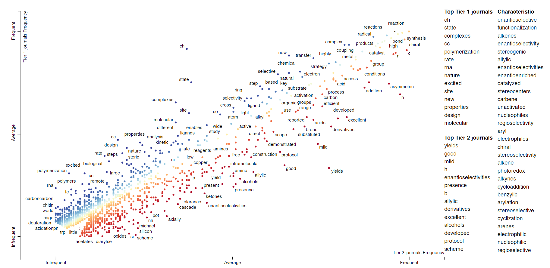
For this analysis we’ll group the journals into Tiers 1 (Science, Nature, J. Am. Chem. Soc., Nat. Chem.) and 2 (the rest). We can plot words based on their relative frequencies in Tier 1 and Tier 2 journals on two axes. The following plot was generated on single word frequencies from the abstracts. Click on the following plots to load the interactive versions (takes about a minute).
Each point on the plot is a word. Its position is determined by its frequency in Tier 2 journals (x axis) and Tier 1 journals (y axis). For example, “CH” in the top middle region of the plot, presumably related to CH functionalization, occurs more frequently in Tier 1 journals and Tier 2 journals. Not every word in the plot is labeled; if you want to look for a particular phrase (e.g. asymmetric), type it in “Search the chart”. If you click on a word, you can see all the contexts in which the word occurred.
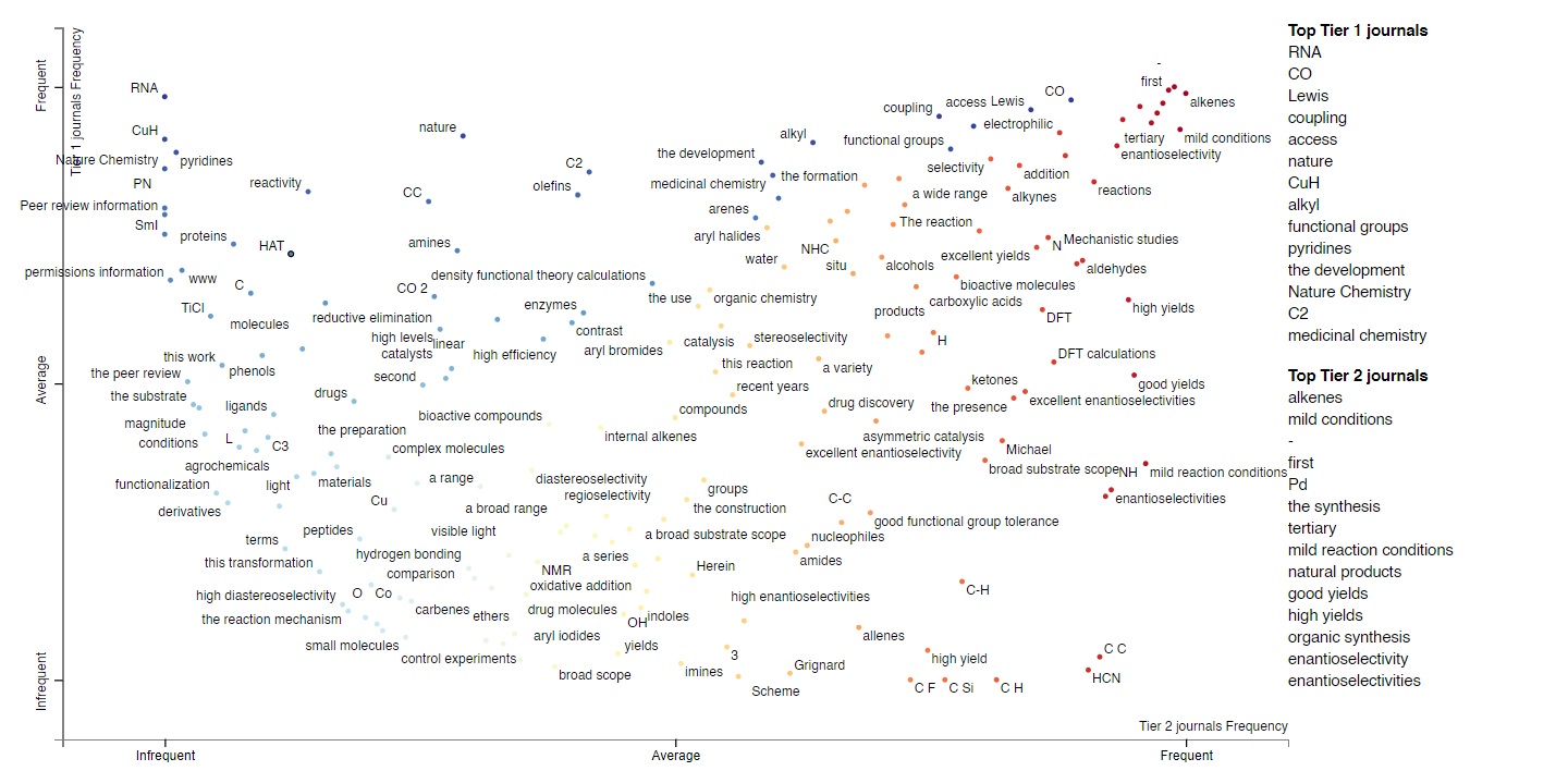
Clearly this is also a way to learn about whether particular words or topics occur more often in higher- vs lower-impact journals. We’re not restricted to individual words; we can also do this with phrases of an arbitrary length (“noncovalent interactions,” “asymmetric catalysis”). Here’s the plot; there are some obvious artifacts like “Nature Chemistry” that should be ignored.
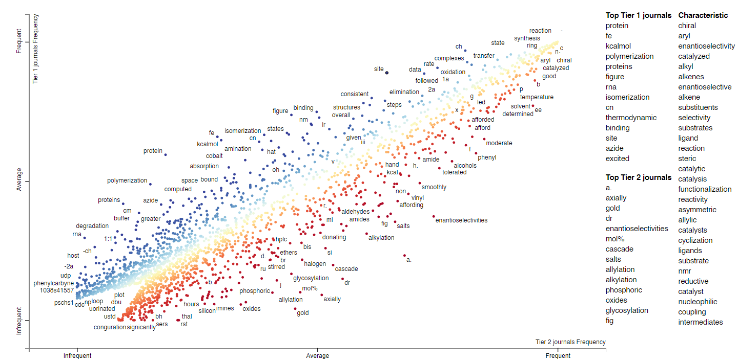
We can extend this analysis to the full texts; here’s the plot/link for single word frequencies for full texts. Now we have a larger body of words, so we can ask questions like, “are KIE studies more prevalent in Tier 1 or Tier 2 journals?”, “are Hammett or RPKA analyses more prevalent?”, “is B3LYP or M062X a more popular functional?” One way to do this is to look for words like “KIE,” “Hammett,” or “DFT” in the following plot. (Since so many words are shown on the plot, it’s probably easiest to just use the search bar.)
Topic modeling
Are there particular reoccurring groups of words across documents that correspond to conceptual topics?
From this collection of abstracts and body texts, we can apply topic modeling to discover “latent” topics that appear across documents. In our case, for instance, we might expect the topic model to discover topics (represented by groups of words) that correspond to conceptual themes like asymmetric synthesis, photoredox, electrochemistry, etc.
We apply Latent Dirichlet allocation, one of the most commonly used topic modeling approaches, to the total group of abstracts and full texts, then to individual journal groups.
Here are the topics modeled for all the abstracts. On the left in the following visualization, the topics (30 in this case) are plotted on a two-dimensional reduction of the feature space (basically Principal Component Analysis). The closer they are, the more “similar” they are in topic space. Click or hover on a particular topic to see the keywords that are associated with the topic, and their prevalence in the corpus (i.e. the body of text). The larger the circle, the more important/prevalent a particular topic is, i.e. topic 18 is most “important,” and that makes sense since it’s a topic about synthetic chemistry (and therefore applies to most papers). Not only can we learn about topics that are important, we could perhaps also learn about vocabulary that was “trendy” this past year.
Here’s the topic model for the abstracts in Group 1 journals (Science and Nature). Because there are much fewer papers in this group, the prevalences of topics are smaller. Though we could potentially learn something from the difference in topic importances.
The topic model for all the texts:
The topic model for texts in Group 1:
If you’re interested, here are the topic models for:
Citations
Which are the most cited journals overall, and by journal group?
We can extract all the citations from the papers this year and group them by journal. This is what we get for all the journals:
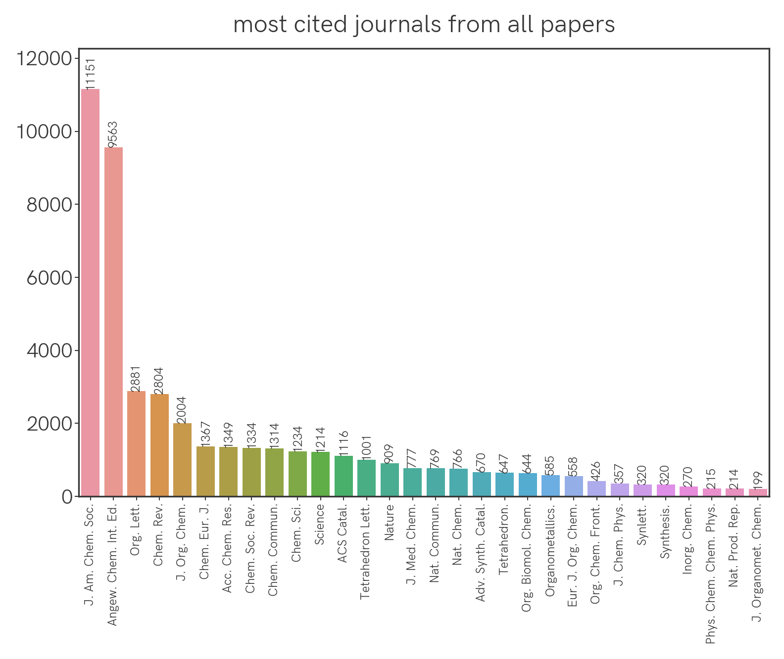
For Group 1 journals:
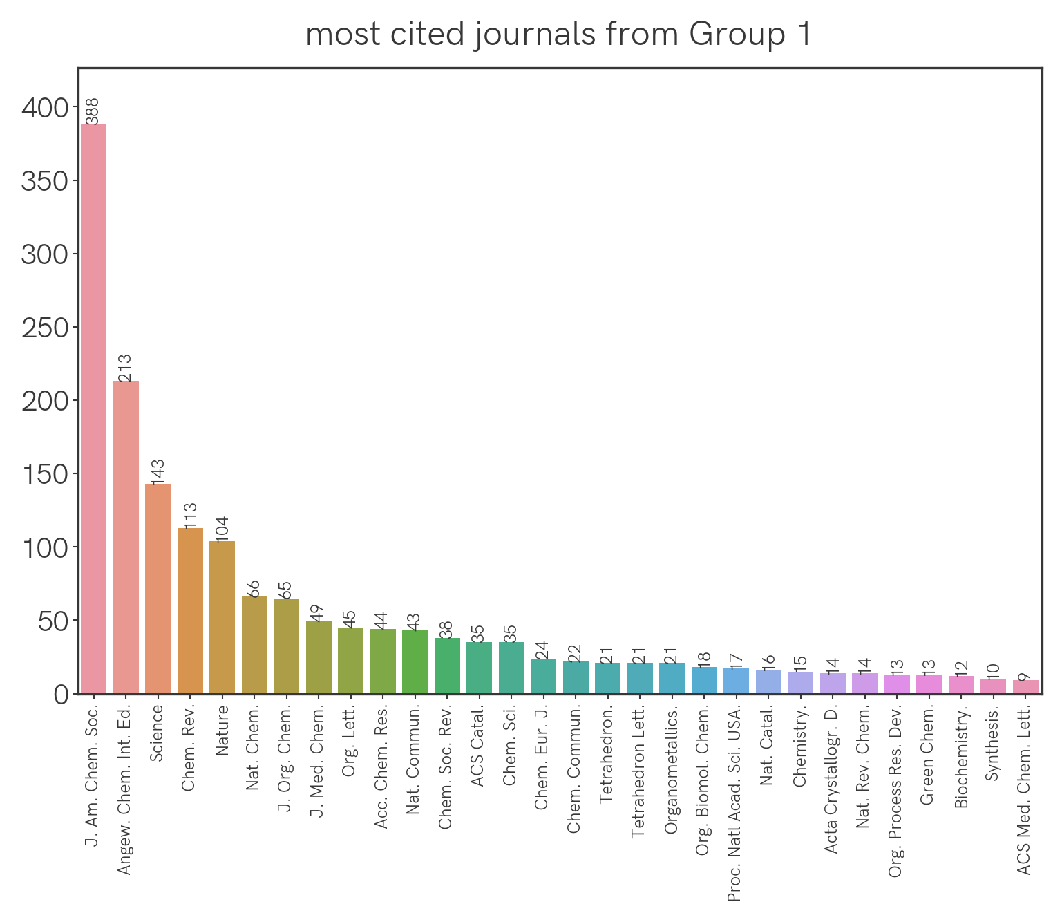
Seemingly the highest-impact journals (Science, Nature) aren’t being cited the most, but this could be confounded by the fact that they simply publish fewer papers that are specific to our field. We can correct for this by normalizing the citation count with the number of relevant papers that were published (this year, as an arbitrary benchmark) in a particular journal. With that we get the following:
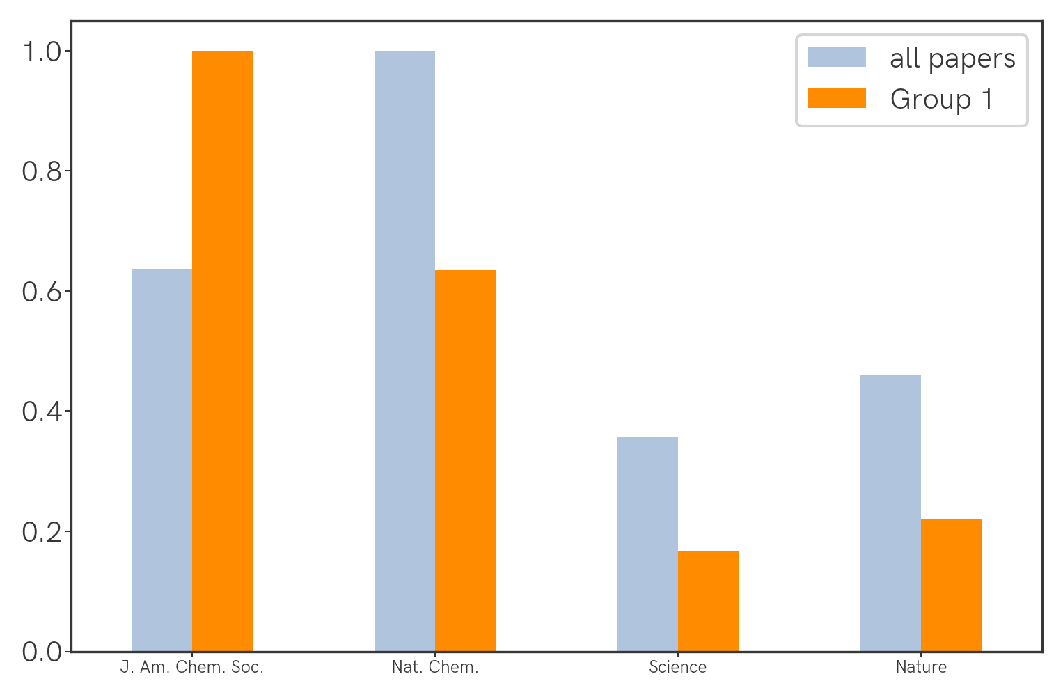 Nat. Chem. wins across all papers, and J. Am. Chem. Soc. wins for Group 1 papers.
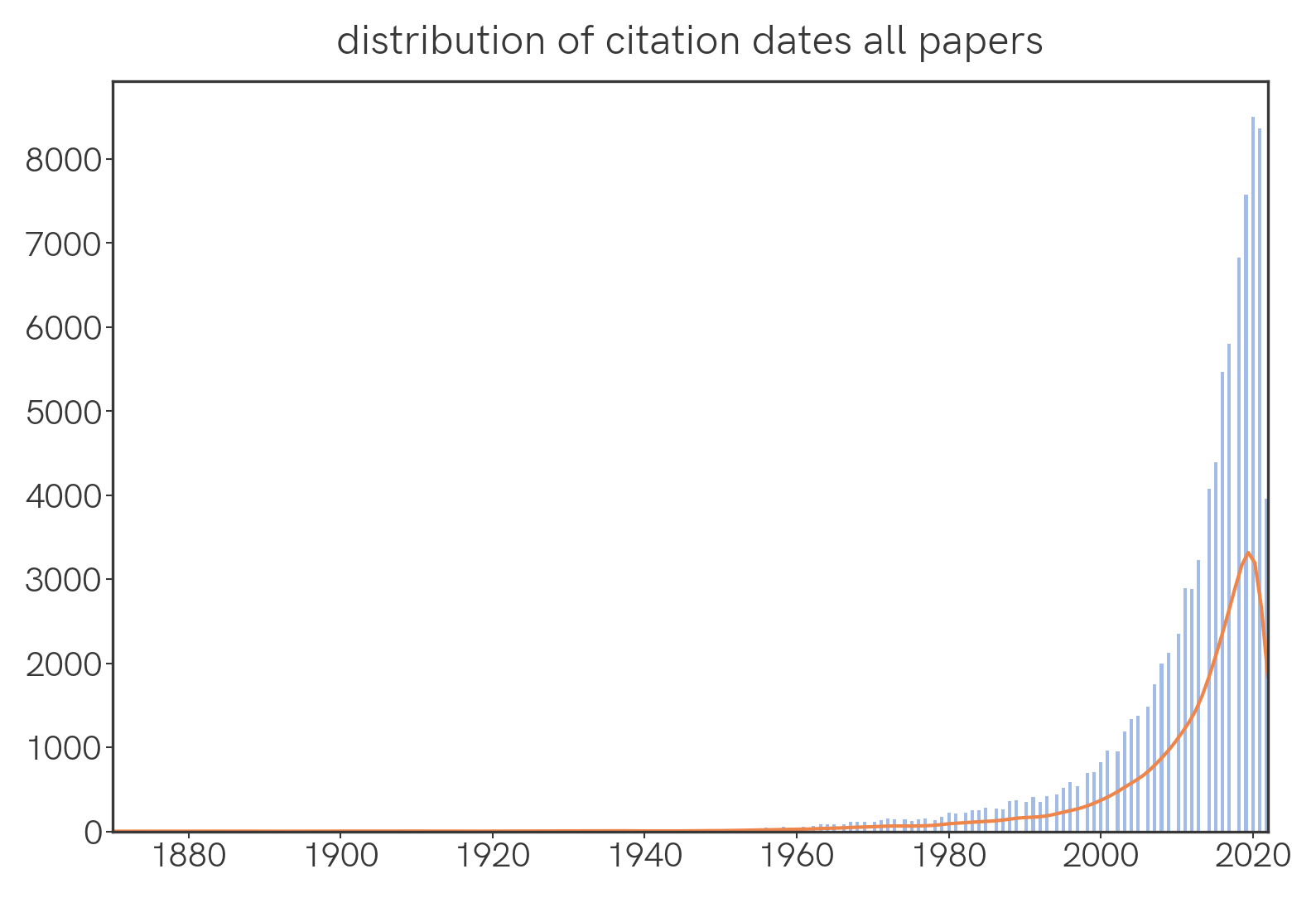
What is the temporal distribution of papers that were cited this year?
We find that the number of cited papers sharply decreases as we go back in time.
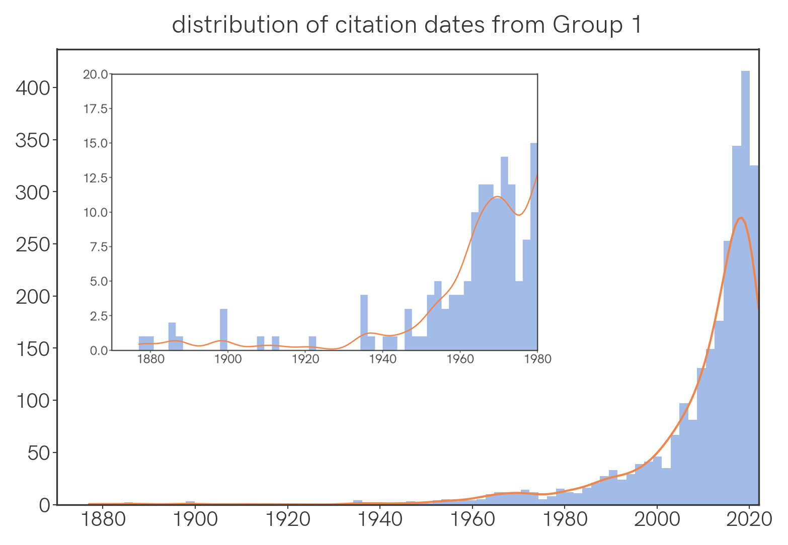
Among Group 1 papers, the same is generally true, though there is an comparatively large number of old papers cited, with a noticeable hump around 1970 🤔.
Word count
What’s the distribution of word count in abstracts and full texts?
Here are violin plots of the word counts of abstracts and main texts, analyzed by group. The width of the plot corresponds to frequency; the dotted lines in the plots are the quartiles.
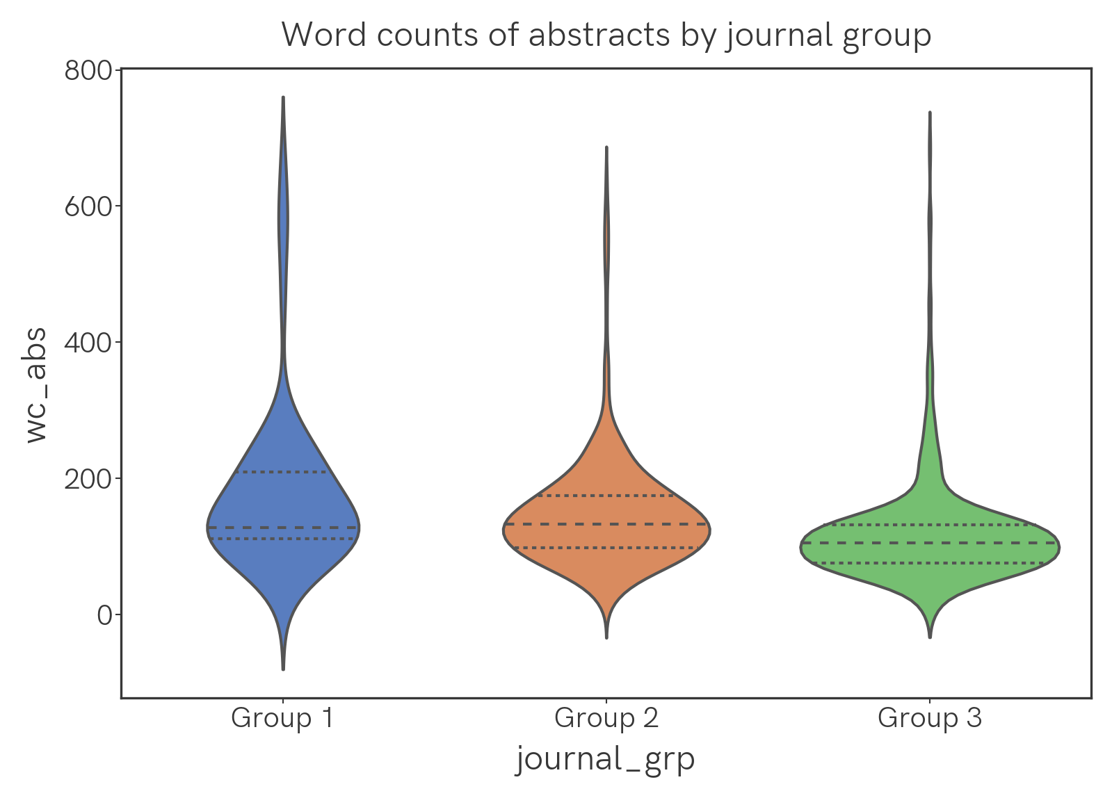
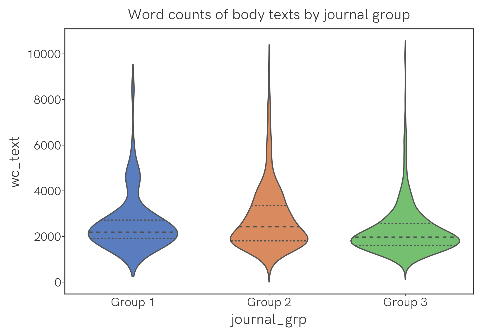
Nothing too surprising here, perhaps, given journal requirements for paper length etc. By word count, the longest paper is Potassium Trimethylsilanolate-Promoted, Anhydrous Suzuki–Miyaura Cross-Coupling Reaction Proceeds via the “Boronate Mechanism”: Evidence for the Alternative Fork in the Trail at 8993 words; the shortest paper is GeCl2·Dioxane–AgBF4 Catalyzed Activation of Glycosyl Fluorides for Glycosylation at 690 words.
Geographies
What’s the geographic distribution of papers we picked this year?
For S&Gs we can plot the affiliations of all the authors on a map, as follows. Red markers correspond to Group 1 and Group 2 journals, blue markers to Group 3. When a location has multiple papers affiliated with it, all their markers overlap and therefore only one (randomly selected) paper marker is shown. Quite a few errors exist, but the overall clustering pattern is probably accurate.
More coming soon
Let me know if there’s anything you’d like to learn from the corpus!
